Choropleth maps with R - the Belgian edition
Dreaded by the yearly quest for the SPSS license code on the university intranet, I switched to R for my statistical work. No regrets so far. You can do wonderful things with R.
One of my first successes was being able to draw maps. Many fantastic blogs are already available (for instance here and here) and I doubt I will do better in explaining how it works. The parochial purpose of this blog is to show how it’s done with some Belgian data.
Installing R and Loading packages
First, you need to install R and an integrated development environment (IDE) such as Rstudio. Open Rstudio, install the packages you will need, and load them into you workspace using the library() command.
install.packages(c("sf","tidyverse","readxl","viridis","ggthemes"))

library(sf) #Simple Features. This is the map-maker
library(tidyverse) #Collection of packages in the tidyverse (see https://www.tidyverse.org/)
library(readxl) #Package to read excel files
library(viridis)  #Nicer colors
library(ggthemes) #Nice theme for maps
Let’s make a map of Flemish municipalities. You need two datasets: one with the municipal borders and one with substantive municipal data on a topic of interest.
Find and read a shapefile
First, you have to find a dataset with municipal borders. These data are usually available as open data. Flemish data can be retrieved from geopunt. In the catalogus of geopunt, you search for ‘referentiebestand gemeentegrenzen’, go the download page and download the zip file with the shapefile. Alternatively, you can use the federal, Belgian administrative data from geo.be and filter out the Flemish municipalities.
Make sure to unzip the shapefile map in your working directory or to provide the full path to the shapefile. For municipal boundaries, select the ‘Refgem.shp’ file.
shpfile <- "~/path_to_your_files/Shapefile/Refgem.shp" #path to file
emptymap <- st_read(dsn = shpfile) #read the shp format into R
You now created an object ’emptymap’ with 308 observations (the municipalities ) in your environment. There are 10 variables. When you inspect the variables, you will notice a variable ‘geometry’. The cells in this variable contain a list of coördinates for the municipal borders. The sf package will use these coördinates to plot the borders. Let’s try with a plot command.
plot(emptymap$geometry) #plot the geometry column
The result is an empty map of Flanders.
![]()
Merge substantive data with map-data
Now, we need some data to fill the map. From a Flemish site with data on municipalities (Gemeentemonitor), I downloaded an excel document with the modes of transport for our daily commutes.
Now read the file into an R dataframe. The function read_xlsx from the readxl package does the job. Note that I first removed some clutter at the bottom of the excel file. I also excluded 12 observations of 2014 for the cities and only kept the 308 from 2017.
Now we have two datasets with borders and one with content. Almost ready to merge all the data in one dataframe. First, however, we need to store the variable with the names of the municipalities (‘NAAM’) in the ’emptymap’ dataframe as a character variable. Let’s give it a new name, ‘Gemeente’, that matches the variable ‘Gemeente’ in de ‘data’ dataframe. Slightly more convenient for the merger.
And now, merge the two dataframes. From the dplyr package, we use ’left_join’ command to add the contents in the ‘data’ dataframe to the ’emptymap’ dataframe. The key for merging is the variable ‘Gemeente’, which is available in both datasets. The new object, ‘data_merged’, is ready for plotting.
Let’s also quickly calculate a new variable with all sustainable transportation modes (walking, cycling and public transport) for the maps.
data <- read_xlsx("static/files/MOB_dominant_vervoersmiddel.xlsx")

emptymap$Gemeente <- as.character(emptymap$NAAM)

data_merged <- left_join(emptymap,data, by= "Gemeente")

data_merged$modalshare <- data_merged$`Openbaar vervoer (%)`+ data_merged$`Met de fiets (%)`+data_merged$`Te voet (%)`
Make the map
Finally, we can make the maps. Since ‘data_merged’ is a regular dataframe, the ggplot package can be easily used to make the map. Alternatively, you can check out the tm package (thematic maps).
Here is the code for the share of cycling.
theme_set(theme_map(base_size = 14))

ggplot(data_merged)+
  geom_sf(aes(fill=`Met de fiets (%)`)) +
  coord_sf(datum = NA)+
  scale_fill_distiller(palette = "Spectral", name="%") +
  labs(
    title = "Commuters by bike in Flanders (Belgium)",
    subtitle = "",
    caption = "Data: Gemeentemonitor 2017") +
  theme(legend.position = c(0.8, 0.8))
- First, the theme of the plot to follow is set. I use the theme_map from the ggthemes package. The base text size is set to 14pt.
- The function ‘ggplot’ creates the actual map. Ggplot’s adds layers over a blank canvas. The call to ggplot creates such a blank canvas. We also tell ggplot which data to use, but you can also do this in your geom_sf() call.
- Next, a geom_sf is added, making use of the geometry variable. We also provide the function with an aesthetic (aes) that tells ggplot to fill with the bike share.
- The coord_sf makes sure that the coordinate reference system of different layers are aligned. Datum = NA removes the long/lat lines.
- The scale filler provides colours for the scale. See this site for more info on different scales and palettes.
- Finally, the labels are defined and the legend position is tweaked.
This is the end result.
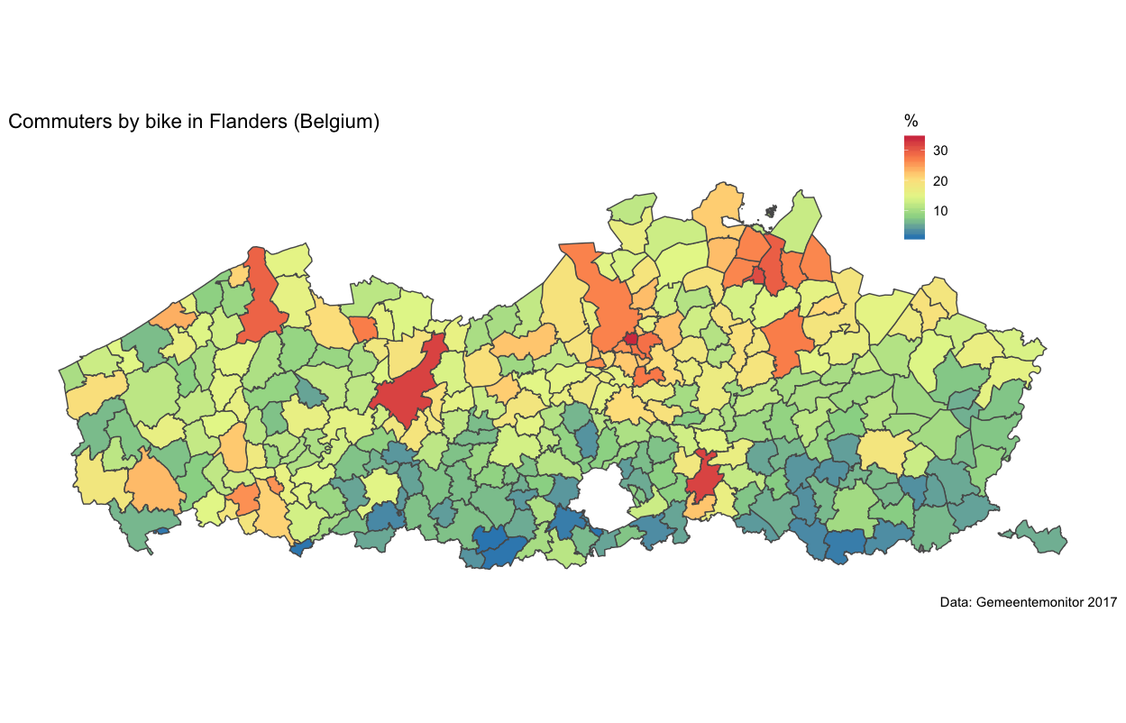
In the larger urban areas (Antwerp, Bruges, Ghent and Leuven), the bike share is around 30%. A runner up for Denmark and the Netherlands. Also in small towns similar levels are reached. Rural areas only have a few cyclists. The suburban area around Brussels doesn’t cycle either, in contrast to suburbanites around Flemish cities (note: Brussels is the white island in Flanders - it’s a seperate region and not in the Flanders shapefile).
A similar map can be made with the new variable of the sustainable modal share (walking, cycling and public transport). Let’s use the viridis pallete from the viridis package. Viridis has some beautiful palettes (check the vignette of the package). Here, I use the cividis palette (option = “E”).
theme_set(theme_map(base_size = 14))
ggplot(data_merged)+
  geom_sf(aes(fill= modalshare)) +
  coord_sf(crs = st_crs(data_merged), datum = NA)+
  scale_fill_viridis(name="% sustainable", option = "E") +
  labs(
    title = "Sustainable modal share in commute (Flanders, Belgium)",
    subtitle = "",
    caption = "Data: Gemeentemonitor 2017") +
  theme(legend.position = c(0.8, 0.8))
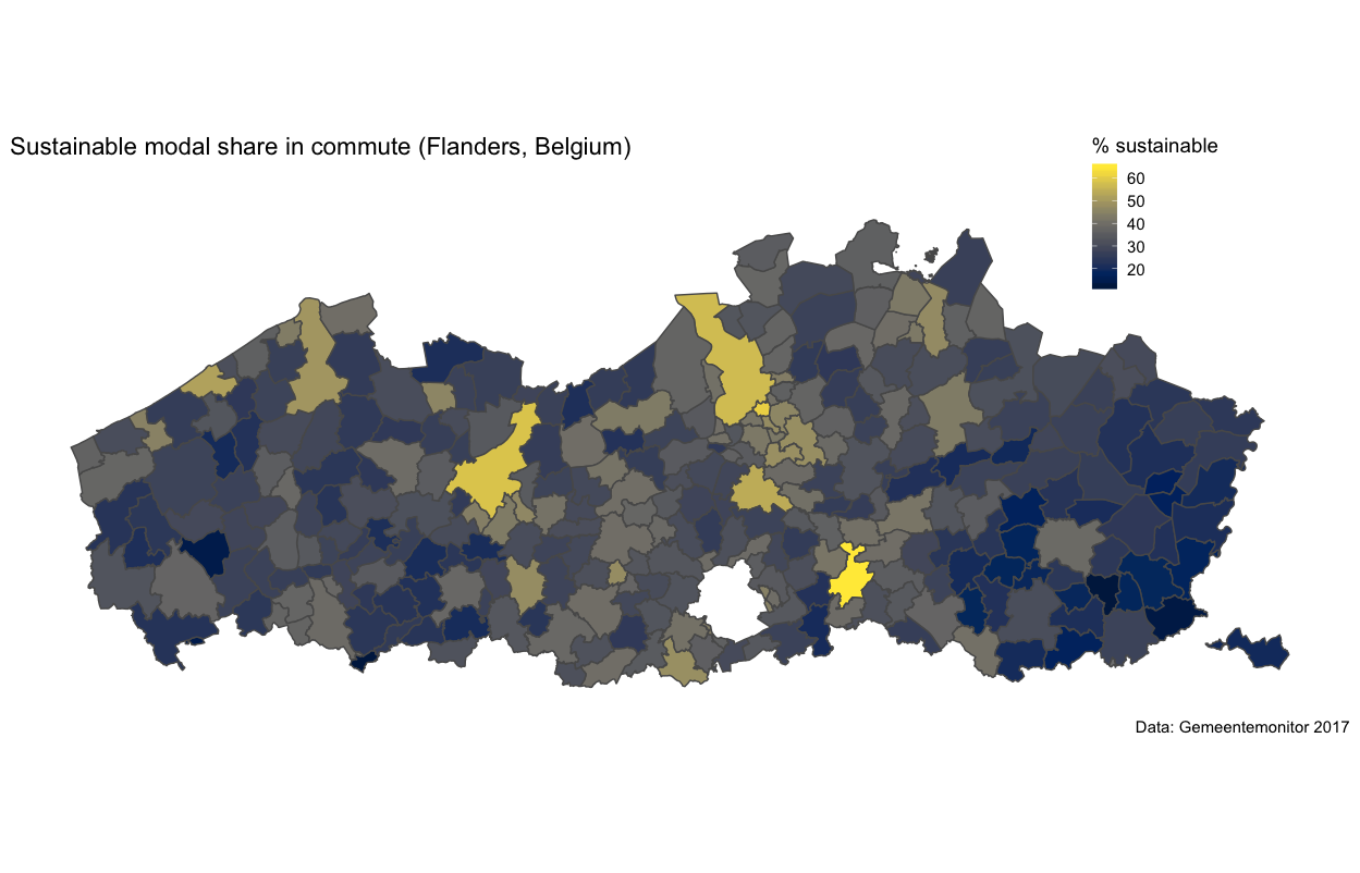
Similar results (not surprisingly). Leuven, a progressive university town, is on top. The big cities of Antwerp and Ghent are on Leuven’s tail. Car use is dominant in more peripheral regions in the east and west.
Another example: neighbourhood data
Belgium has a good statistical classification of the smallest geographical units (neighborhoods, parks, bodies of water, etc.). Statbel calls them ‘statistical sectors’. I came across this classification in a study to identify neighborhood effects in protest against large infrastructure in Antwerp (conclusion: social capital is an important predictor of protest). You can make some nice maps with the statistical sector data. The approach is the same as the municipalities.
First, find the dataset with borders. It is on the website of Statistics Belgium or on www.geo.be. Note that there is no shapefile here, so let’s download the .gml file. Again, you need to include the exact path to the file. st_read from the sf package reads the file into R like a breeze. Inspect the dataset and you will notice that we have 19782 observations. That’s the number of statistical sectors, each with a set of borders in the geometry variable (a polygon).
gmlfile <- "~/Path/to/your_directory/sh_statbel_statistical_sectors.gml"
emptymap2 <- st_read(dsn = gmlfile)
Next, we have to find some data. Statistics Belgium provides income data for the sectors. Let’s use this dataset. I downloaded the excel file and read it into R with read_xlsx from the readxl package. The data is well organised, but for plotting, some data wrangling is needed.
With dplyr, we select the year 2016, then we create a new variable that excludes extreme values (median incomes above 40000 and below 10000). You have to go up and forth from your map to the data to find the right bandwith. It should show differences, but you don’t want to lose too many observations. The so-called pipe operator (%>%) passes the object (here, the transformed dataset) to the next function. It can be read as ’then do this’.
Next step is to merge the data with the empty map with a left join.
data_fisc <- read_xlsx("path_to_file/TF_PSNL_INC_TAX.xlsx")
data_fisc2 <- filter(data_fisc, CD_YEAR == "2016")%>%
  mutate(MS_MEDIAN_NET_TAXABLE_INC_2=replace(MS_MEDIAN_NET_TAXABLE_INC,
                                             MS_MEDIAN_NET_TAXABLE_INC > 40000 | MS_MEDIAN_NET_TAXABLE_INC < 10000,
                                             NA))
data_fisc2_merged <- left_join(emptymap2,data_fisc2, by= c("CD_SECTOR"="TX_SECTOR_DESCR_NL"))
The following step is to create the map. The strategy is roughly the same as in the municipal data, but some tweaking was needed to make the plot look good. In the geom_sf layer, the size if the borders is set to 0.05 and the color is grey ("#CCCCCC"). When you plot close to 20000 units, the borders need to be thin. Otherwise, you will only see borders on your map.
ggplot(data_fisc2_merged)+
  geom_sf(aes(fill=MS_MEDIAN_NET_TAXABLE_INC_2),size = 0.05, color = "#CCCCCC") +
  coord_sf(crs = st_crs(data_fisc2_merged), datum = NA)+
  scale_fill_viridis(name="euro",na.value="white") +
  labs(
    title = "Median taxable income in Belgium (2016)",
    subtitle = "",
    caption = "Data: Statbel 2016") +
  theme(legend.position = c(0.8, 0.8))
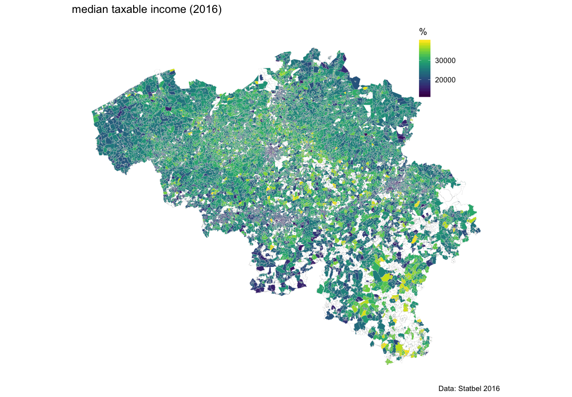
Provided you know the layout of the country, you can try to interpret the map. But it’s very crowded and interpretation of a map shouldn’t be a Rorschach test. It would be nice if we could zoom in on a part of the territory. This is actually very easy. Let’s do Brussels. The statistical sectors can be filtered based on the identifier for the Brussels capital region. Next, you feed the data to your map-script
fisc_bxl <- filter(data_fisc2_merged, TX_RGN_DESCR_NL %in% c("Brussels Hoofdstedelijk Gewest"))

### from here on, the same script but a different database

ggplot(fisc_bxl)+
  geom_sf(aes(fill=MS_MEDIAN_NET_TAXABLE_INC_2),size = 0.1, color = "#CCCCCC") +
  coord_sf(crs = st_crs(fisc_bxl), datum = NA)+
  scale_fill_viridis(name="euro",na.value="white") +
  labs(
    title = "Median taxable income Brussels (2016)",
    subtitle = "",
    caption = "Data: Statbel 2016") +
  theme(legend.position = c(0.8, 0.8))
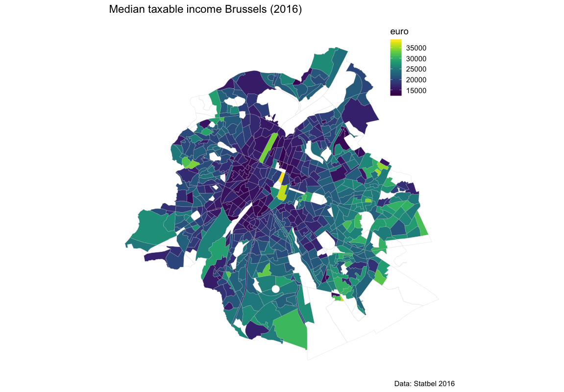
And this is the result. Lower income is situated in the centre of the city. The lightgreen bar in the centre is an area around a canal that is being developed with fancy appartments. South-west of the canal is Molenbeek - the area that made Trump call Brussels a hellhole. Let me add that even Molenbeek is safer than many neighborhoods in US cities.
Finally, for old time’s sake, I zoom in on the town where I grew up: Turnhout. It’s a small regional town that serves a broader region. I also add two adjacant towns: Vosselaar to the west and Oud Turnhout to the east. Let’s change the palette to inferno to add a little drama.
I will add another layer (geom_sf) that maps the municipal borders over the statistical sectors. My data are read from a shapefile with admnistrative data from geo.be, the federal geoportal. The size is thicker (size = 3) and the fill is transparant (fill = NA). It shows that you can add different layers from different datasets to a map.
### select the data
fisc_turnhout <- filter(data_fisc2_merged, TX_MUNTY_DESCR_NL %in% c("Turnhout", "Oud-Turnhout","Vosselaar"))

### An additional layer with municipal borders
munic <- "~/path_to_your_file/AD_2_Municipality.shp"
munic_map <- st_read(dsn = munic)

munic_map2 <- filter(munic_map, NameDut %in% c("Turnhout","Oud-Turnhout","Vosselaar"))

### and plot
theme_set(theme_map(base_size = 14))
ggplot()+
  geom_sf(data = fisc_turnhout, aes(fill=MS_MEDIAN_NET_TAXABLE_INC),size = 0.1, color = "#CCCCCC") +
  geom_sf(data = munic_map2,fill=NA, size = 3, color = "black")+
  coord_sf(datum = NA)+
  scale_fill_viridis(option="inferno", name="euro",na.value="white") +
  labs(
    title = "Median taxable income Turnhout city region (2016)",
    subtitle = "",
    caption = "Data: Statbel 2016") +
  theme(legend.position = c(1, 0.8))
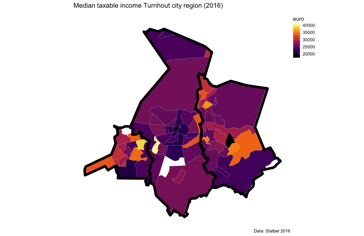
Vosselaar and Oud-Turnhout are rich, in particular compared to Turnhout (in the middle). The last big merger of municipalities in Belgium in 1976 has passed by Turnhout. At the time, all political majorities in the region were firmly in the hands of the ruling party (Christen-Democrats). Hence, there was less political urgency for mergers or gerrymandering. In the future, we can expect a debate on a new merger. But why would Vosselaar and Oud-Turnhout agree to that?
This is it. With some lines of code, you can create nice maps! Also with Belgian data.
Wouter Van Dooren
Professor of Public Administration
My research interests include public sector performance; performance information, accountability and learning; and conflict in public participation